
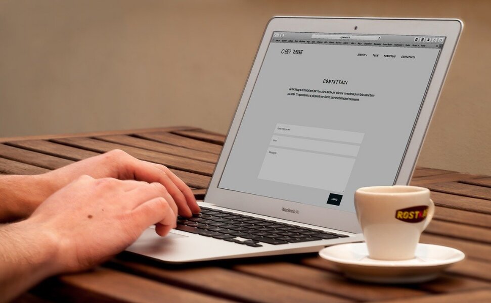
Did you know that 94% of first impressions relate to your site’s web design? And while the stakes are so high, a lot of website owners still tend to overlook the significance of a great web design in terms of their business’ first impression. And that certainly needs to be taken care of.
Well, neither was Rome built in a day nor great websites are. Designing and running a stunning and highly-functional website means a substantial amount of research and work. Because if that part is skipped, the result is a website with a bad user experience. And a poor website might send across a very wrong impression that can harm your business’ reputation. And that is definitely trouble for a site’s conversion.
Conversion metrics tell that 46% of people say a website’s design is the #1 criterion for discerning credibility. Hence, the site’s web design needs to be done professionally, carry easy to comprehend elements, and be absolutely fast loading. It is only then that website owners can certainly improve their chances of converting visitors to leads.
So, now that we are talking about using web design and conversion factors to the benefit of each other, let’s see how you can use certain web design techniques to turn your site visitors into leads.
1. Address everything that enhances the site’s loading speed
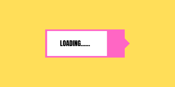
This one is a major giveaway. As the website owners keep adding layers and layers of web design, the site keeps getting chunkier. And a heavy website has a hard time when it comes to loading swiftly. And what further worsens the damage is the fact that 40% of site visitors feel free to abandon the website if the site fails to load within 2 seconds. Also, a fast loading website is favored by the search engines in terms of visibility, generating traffic, converting them into leads, then customers.
Now that you know that working on your site’s web design elements in a manner that it does not affect its loading speed matters, how do we go about it? The layout of your web design is a crucial factor. It is important to choose simple and intuitive elements that are not very complex and are not adding any further chunkiness to your site’s design. A user-friendly and well-optimized design layout should be your go-to choice.
2. Put efforts into simplifying your site’s navigation

As soon as you reach a website’s home page, what is your next immediate step? Well, what the audience usually does is they try to figure out ‘where-to-next’. And that involves mapping all the other next steps as well. Hence, the web design of your site should allow users to easily go to another page regardless of where they started. The key is to not overwhelm the user with unnecessary navigational elements. Just keep it simple by adding a maximum of five to seven options. This keeps the visitor focused, offers them limited routes to take, and hence, convert better.
Keep an eye for your audience feedback. Based on their interaction with your site, you might want to add certain on demand graphic design elements.
3. Don’t miss out on the ‘Search’ functionality

Clear navigation is all about letting your visitors find information quickly, without having to go all around the website. According to Search Engine Journal, the ‘search box’ feature is considered more vital than the rest. Websites that especially have hundreds of categorized pages, can benefit well from the search bar functionality.
Why this functionality really matters is because visitors instead of leaving the site (in case they have difficulty in finding the information they are looking for) can always input the related keywords and arrive at a related result. Hence, the feature gives users the opportunity to see as much of your website as possible. When they have the time and opportunity to check out your website, their readiness to convert is enhanced drastically.
4. The magic of ‘Negative space’
Also known as white space, this design element does work in mysterious ways. On a design surface, the empty area of the layout is what marks the negative space/white space. This design element is unique because it allows other design elements to breathe and mark their identities for the onlookers to see.
Hence, if your website is looking to build up effective visual performance for its audience, the intelligent implementation of negative space is a must. For novice website designers, the right thing to do is begin by breaking the monotony in heavy pages by using ample negative space, the right combination of rich images, and thoughtful creativity.
“White space is like a canvas: it’s the background that holds the elements together in a design, enabling them to stand out” – says Mads Soegaard from Interaction Design Foundation.
5. Exit Intent Pop-Ups as lead generation design tools
Did you know that when done properly, exit intent pop-ups typically increase conversions by 5-10%?
Yes, that’s right. And they are quite effective for leaving site visitors. These exit pop-ups are triggered as and when the visitors are ready to hit ‘close’ on the window tab. These pop-ups are great for getting newsletters sign-ups as well and tools like Sumo, ShareThis, or WisePops can help you get the work done.
6. Use a Fullscreen Welcome Mat
While browsing through a website, we often come across full-screen pop-ups that contain a very loud and clear CTA (Call-to-Action) button. They make up for a great design element when it comes to leads and conversions. So, if you are a fan, all you need to do is install a fullscreen welcome gate on your homepage. This design element effectively helps in getting the message across by minimizing any and all distractions on the homepage, letting the visitor see and hear what you want them to.
7. The ‘Color’ element is crucial
The right colors on your website can make or break the entire game of your site’s first impression. They are not just aesthetically appealing but carry their expression, when it comes to brand colors. They are certainly the most important web design elements and can easily convey the meaning of your website. Hence, it is highly recommended to choose a suitable color scheme for your website. Inspiration from your competition and even visual platforms such as Behance, Pinterest can go a long way.
At the end of the day, remember to keep all things simple yet impactful. You merely have a mere 8 seconds to capture a unique site visitor’s attention and you really need to leave no stone unturned to get the ball rolling. This, of course, is going to benefit your site conversions, capture new leads, and get your business going.